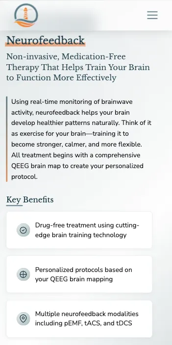
A new website for Lighthouse Therapeutics.
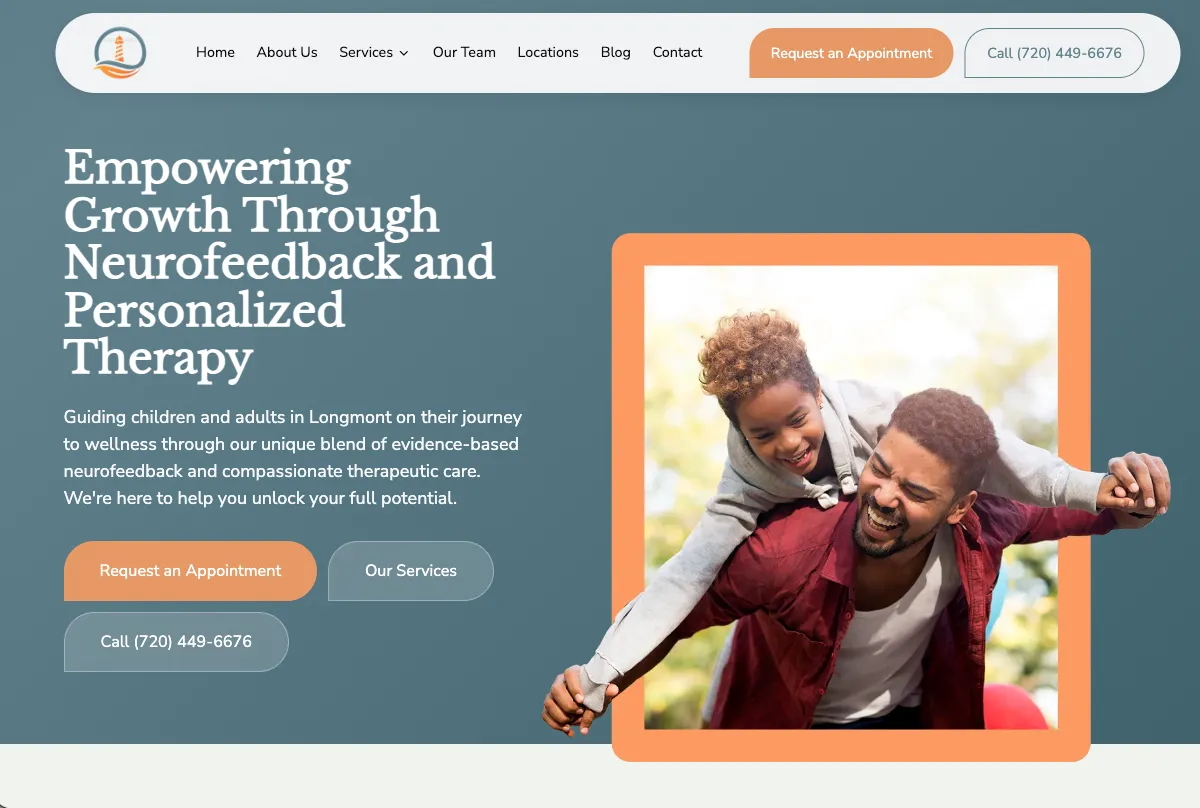
Two websites. Two audiences. One practice nobody could find in full.
Lighthouse had been running two separate websites for one practice — one for behavior therapy, one for neurofeedback — and the split cost them on both ends. A parent researching ABA for their autistic four-year-old never learned the same clinic could help them with their own anxiety. An adult who found the neurofeedback site had no idea there was a twenty-person clinical team behind it. Worse, they lead with a treatment most people have never heard of: QEEG brain mapping and neurofeedback, which has to be explained before it can be sold.
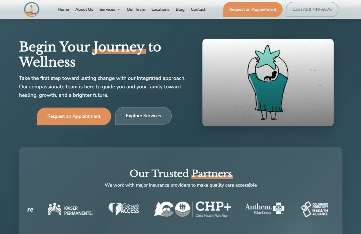
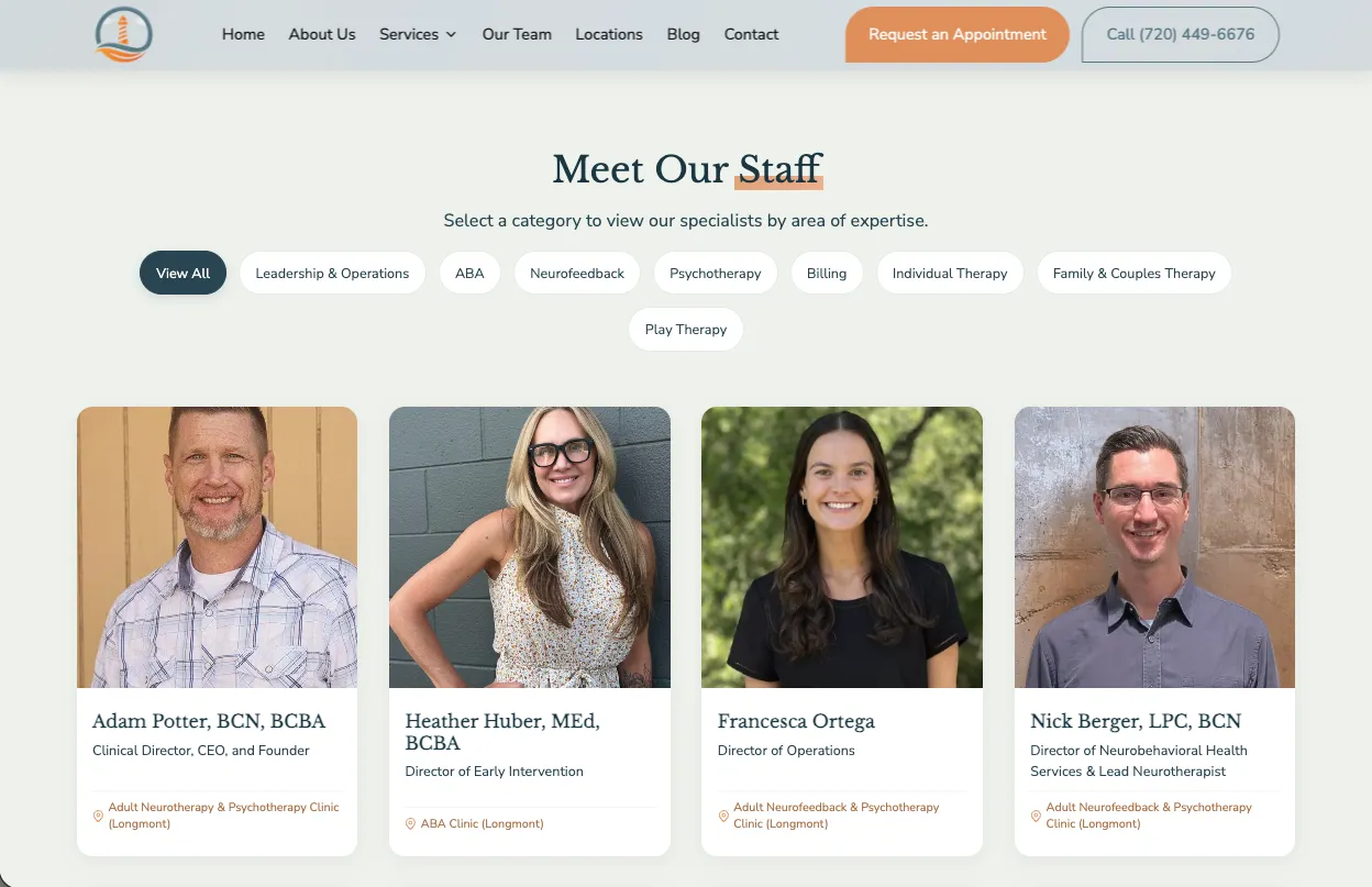
One custom site organized around the only distinction that actually matters to a visitor: who the care is for. Two audience paths (adult and pediatric) branch from the homepage and the nav, each routing into the four service lines — ABA, neurofeedback, psychotherapy, and family & couples therapy. Every service page explains the science before it asks for anything, and a full pricing and insurance section publishes real session rates, package pricing, and the free benefits-verification offer. Both old domains now redirect to the new site, and so do their old page addresses, which is how our website redesign services handle any site being replaced.
A parent and an adult client land on the same homepage and immediately see a different site. The neurofeedback explanation carries its own weight instead of leaning on a phone call. And the practice finally reads as one clinic — three locations, four services, one team — instead of two half-brands competing for the same search results. It is the same approach we bring to websites for therapists in private and group practice, and to websites for medical practices.
Built for two audiences, from one component library.
Four services. Two audiences. One path through each.
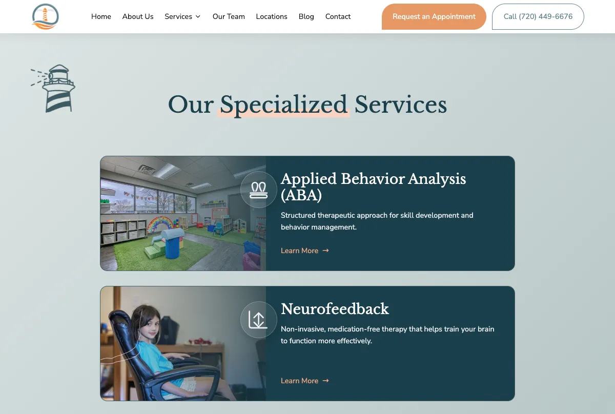
We do four different things for two very different groups of people, and explaining that had always been the hard part. Bullfinch figured out the structure before they designed anything — and now people arrive already understanding what we offer.
We organized the site by who the care is for.
We split the site by audience, not by service.
Every clinic site we looked at organizes around treatment names. But a parent doesn't shop for "Applied Behavior Analysis" — they shop for help with their kid. We built two entry points, adult and pediatric, and let the four service lines sit underneath both. The nav answers the visitor's first question before they ask it.
We explained the science before selling it.
Neurofeedback and QEEG brain mapping need teaching, not marketing. Each service page walks through what the treatment actually is, what a session feels like, and what it treats — in plain language, without the jargon that makes people close the tab.
We published the prices.
Almost no behavioral health practice does this. Session rates, package pricing, and the free insurance benefits verification all live on the site. The calls that come in now are from people who already know what it costs — and the front desk stops fielding the same question all day.
Parents research this at 11pm on a phone.