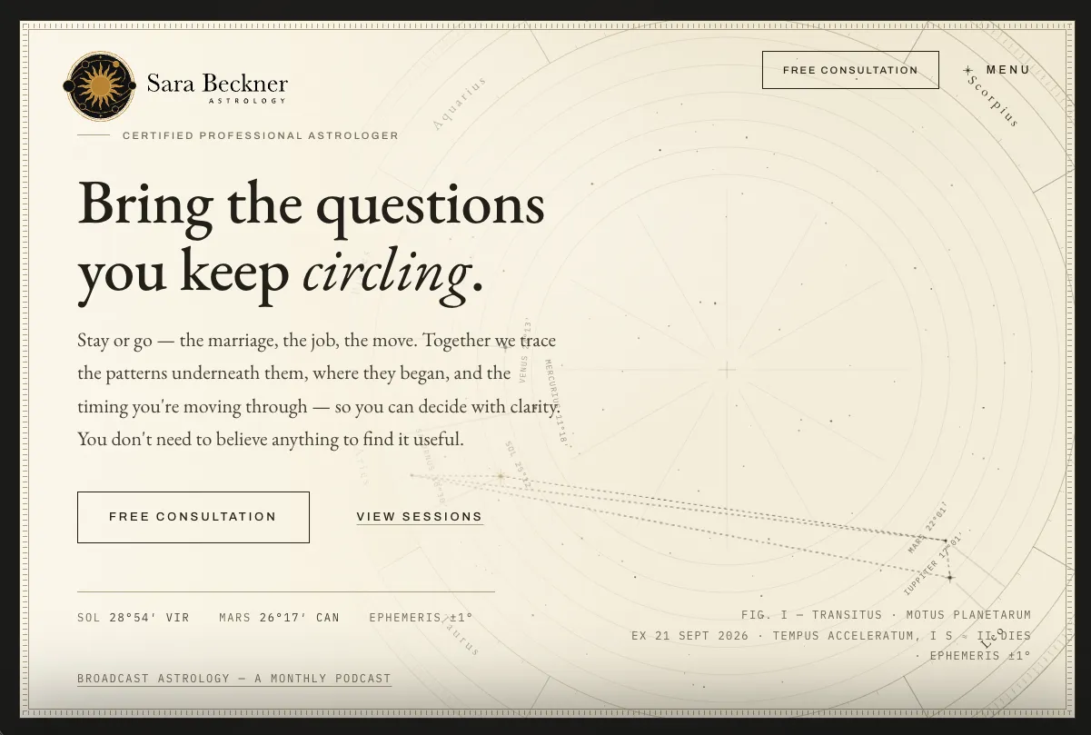
One hour to sell. A method nobody expects. A site that explains it without a menu.
Sara is a working astrologer with a counseling-heavy practice, a client list that spans continents, and a website that looked like an old-school homemade build. Her old site sold readings as a menu of services. Prospects kept emailing her the same thing: I don't know what I need. She wanted the site to lead with what a client gets, not with her biography, and she wanted it before the biggest astrology conference in the world.
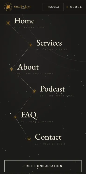
A five-page custom site built around a single offer: one private hour, decided together in the room. The homepage sells the outcome, the About page explains her method, Services turns the itemized menu into six shapes the hour can take, Contact removes every reason not to book, and the Podcast page pulls her monthly show into the practice, with every episode archived and linked. A coach's site has the same job, one person selling private sessions to strangers deciding whether to book, so this is the build we point to on our coach website design page.
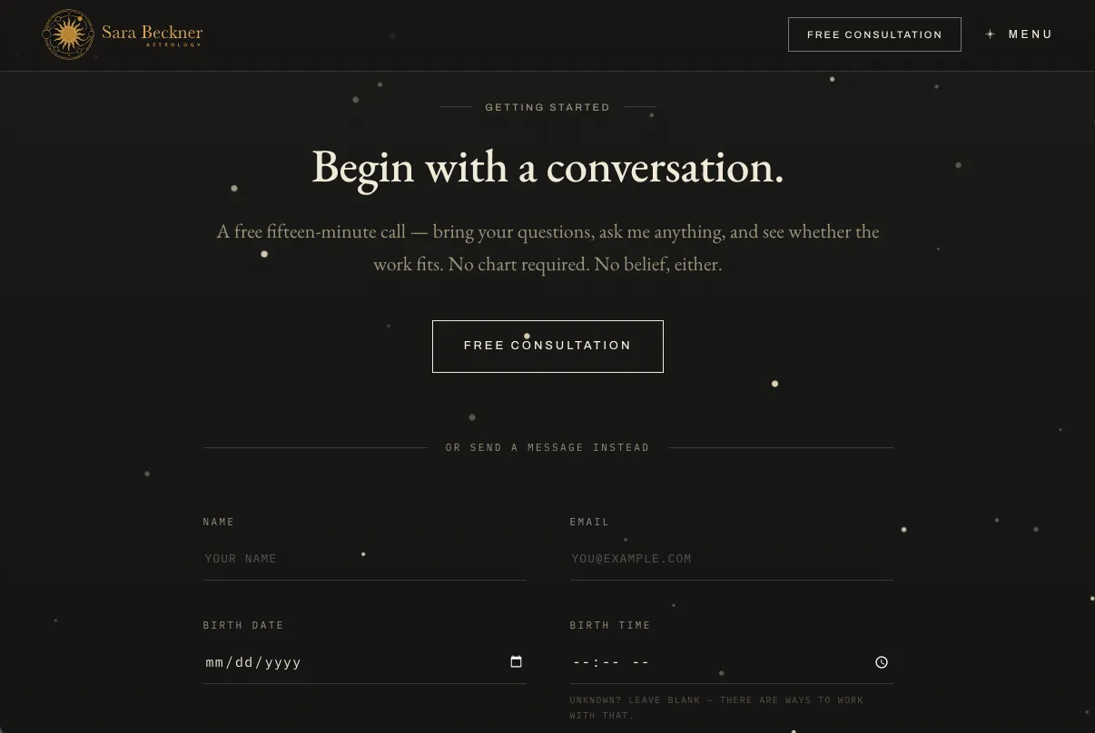
Pricing is transparent without becoming a menu. The free 15-minute call is one click from anywhere on the site, on a calendar she controls. And the part of her work nobody else in her field leads with, starting with the childhood rather than the crisis, is finally said out loud on the page.
Built like an almanac, not a template.
Five pages. Every one numbered like a plate in an old almanac.
I'm not geared towards self-promotion, and I didn't know how you'd translate what I do into a website. Bullfinch somehow did it — and the speed and the way they work professionally was exactly the kind of tightness I want in my own practice.
Built around the hour, not around a menu.
We cut the menu before we drew anything.
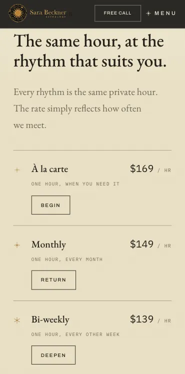
Her old site sold readings like a price list, and it was making people less likely to book, not more. We rebuilt the offer as one private hour with four rhythms (à la carte, monthly, bi-weekly, weekly) and six things that hour can hold. Every price is on the page. Nothing asks you to choose a product.
Every page gets its own figure.
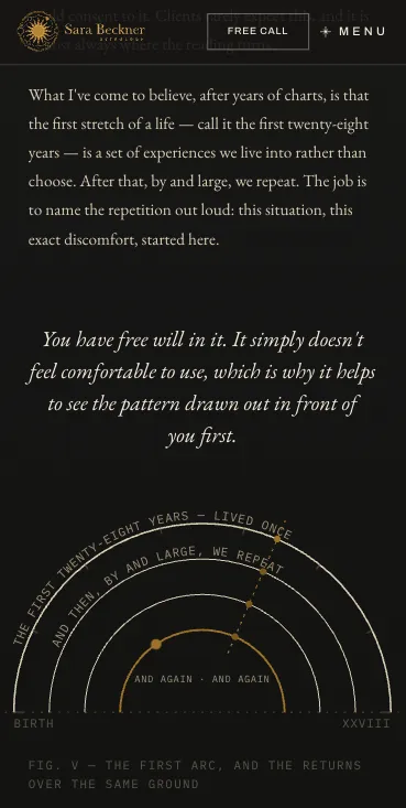
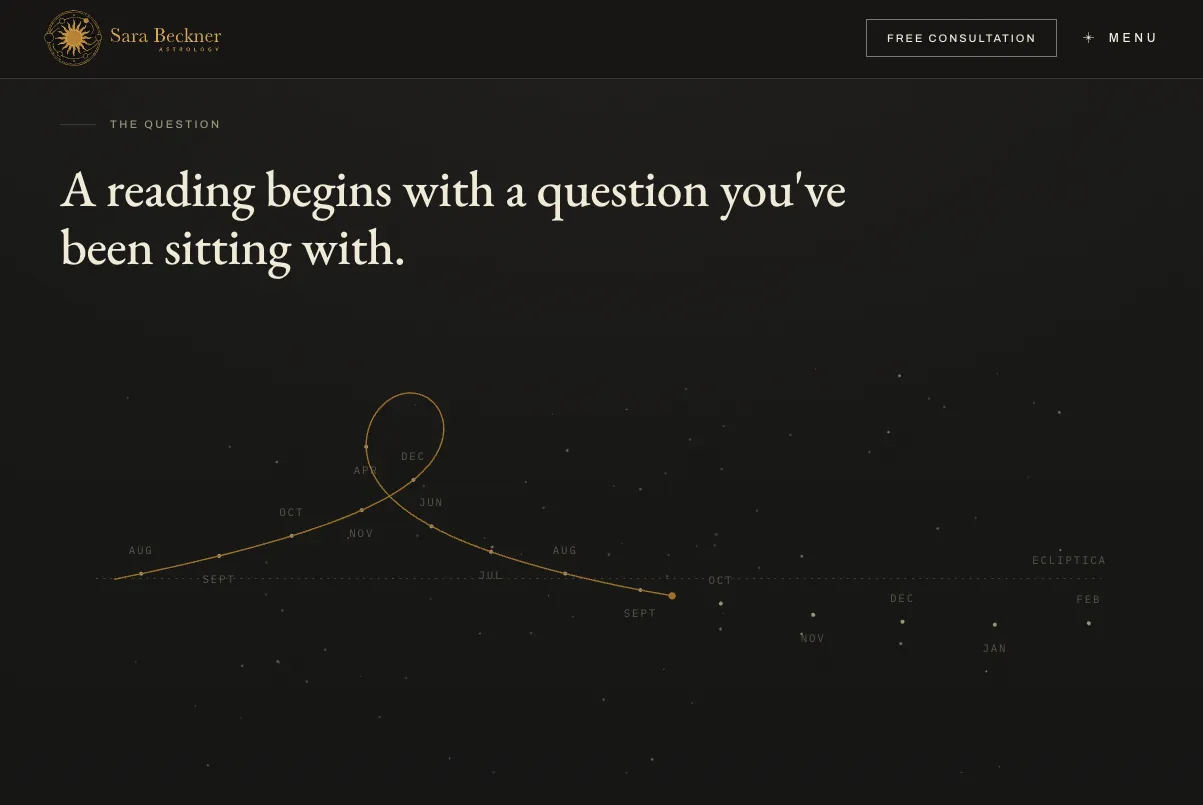
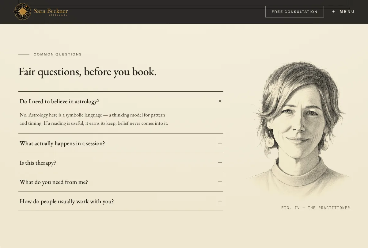
The design language is an engraved almanac: Latin planet names, Roman-numeral plates, numbered figures. It is strict enough to be recognizable and loose enough that every page gets a signature piece of its own. Her CV is drawn as returns around an orbit rather than a timeline, and the Contact page has a working guide to finding your birth time. Twelve figures across five pages, and no two are alike.
A free call, without an open calendar.
She wanted a low-friction first step but didn't want her whole schedule public. The free 15-minute call runs on a Calendly with windows she opens herself, backed by a birth-data form for people who would rather write first. Paid readings are still booked behind the scenes, on her terms.
Half her clients are people she's never met.