A new website for Cattle Country Festival.
A three-day country festival deserves a site that sounds like Texas.
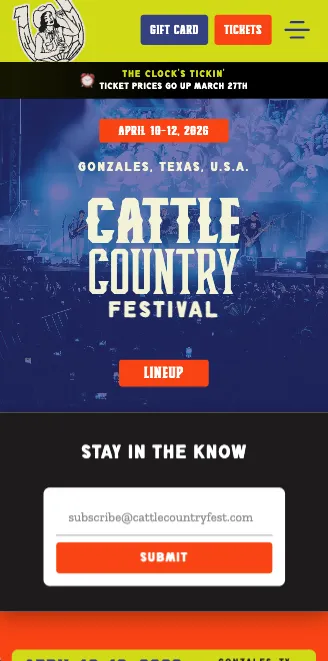
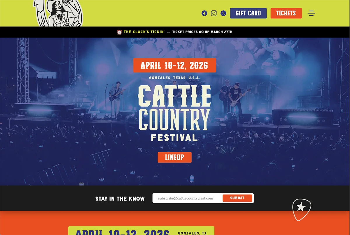
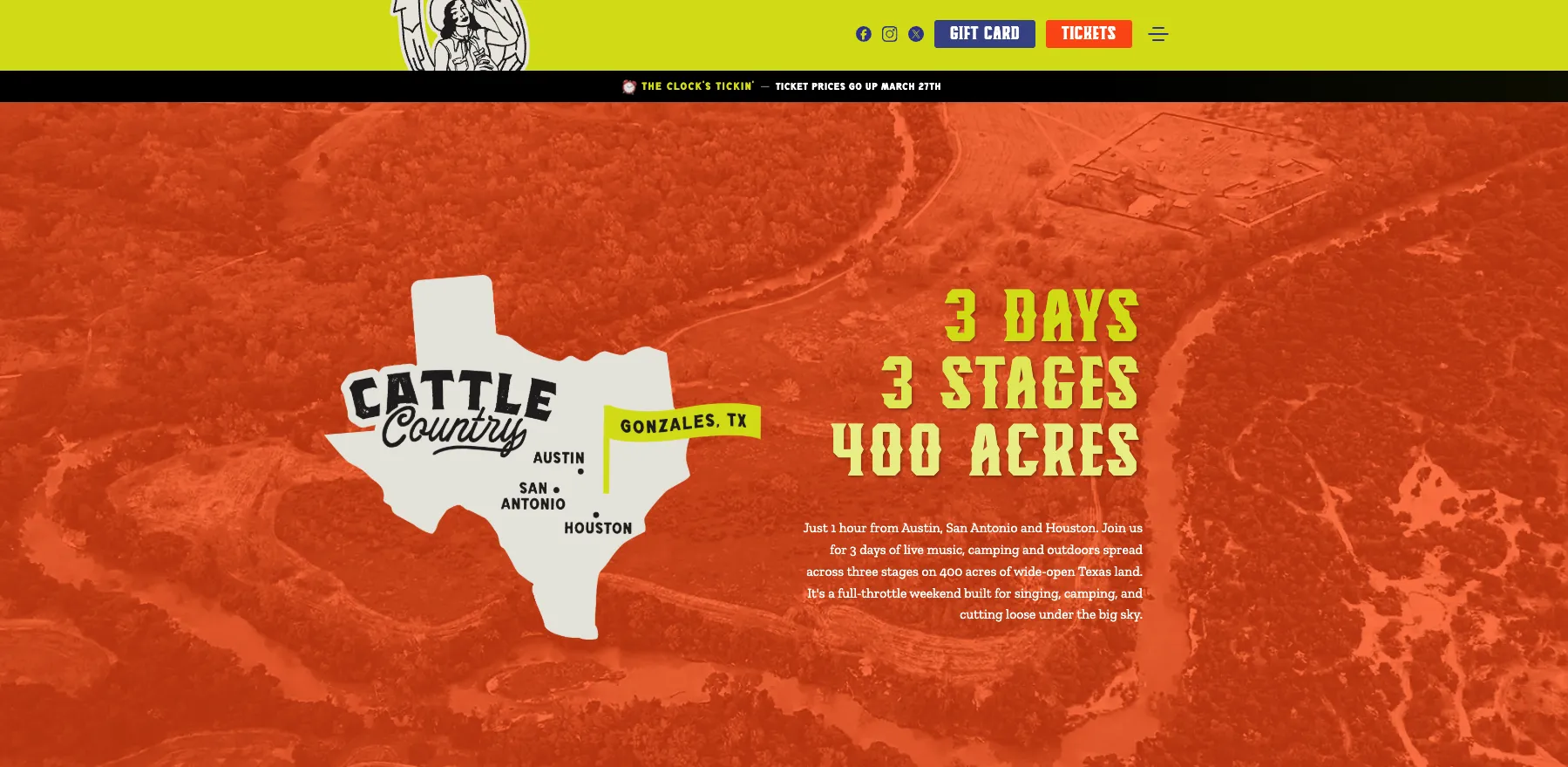
Three days, three stages, four hundred acres of camping outside Gonzales, Texas. The festival had the lineup, the rodeo, the forty-something sponsors — and a placeholder site that read like every other 'event landing page' on the internet. None of the Texas in it.
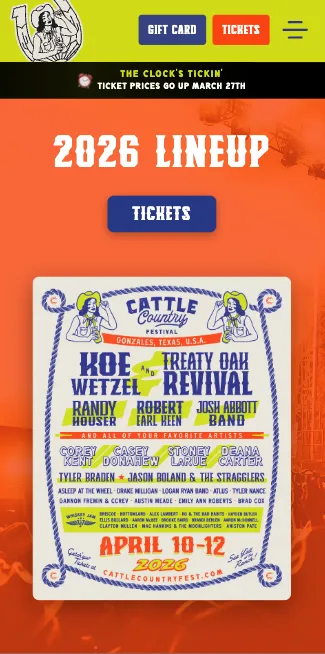
A festival site shaped around how people actually plan a country weekend: lineup, camping, group packages, getting there. Western-leaning typography, illustrated rodeo motifs, urgency around ticket waves. Sponsor wall that can grow without breaking. Big Rig Rodeo gets its own page because it deserves it.
A site that reads like the festival sounds. Camping tiers and group packages are easy to compare and easy to book. The sponsor carousel pulled in late additions without a redesign. The 'Clock's tickin'' pre-sale headline did its job.
Loud, fast, easy to book.
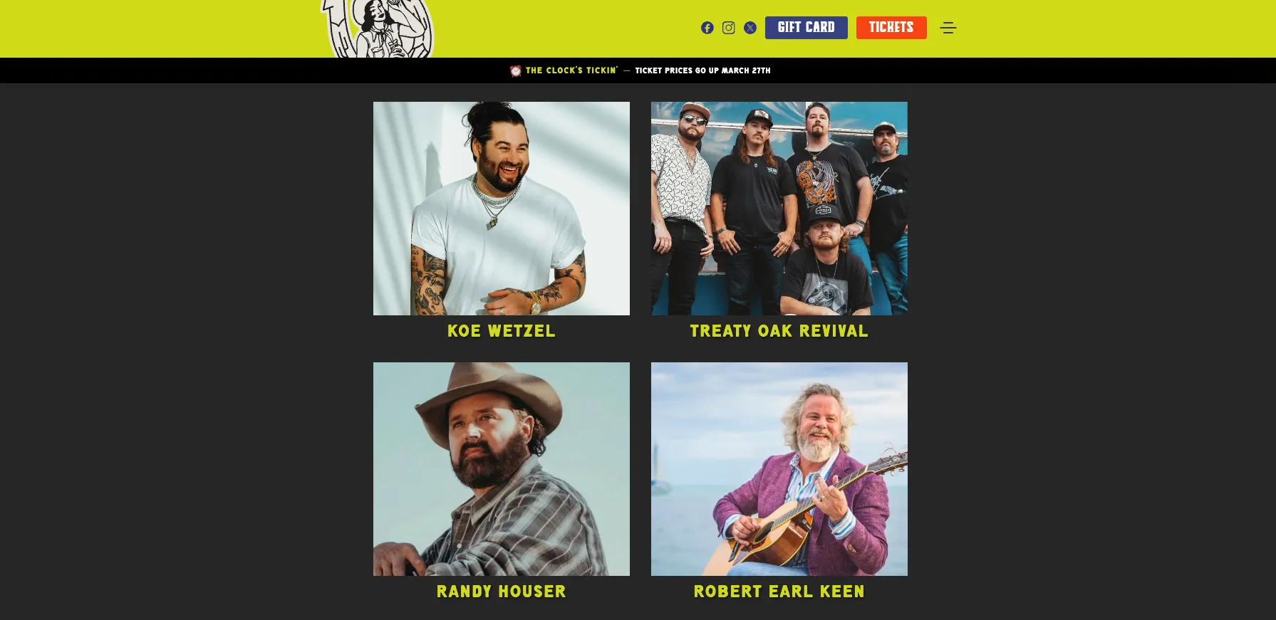
Twelve pages built around how a country fan plans a weekend.
Every other agency wanted to make us look like a corporate conference. Bullfinch got Texas, the rodeo, the chrome — and shipped a site that sounds the way our fans talk.
Three weeks. Western, not generic.
We dug into country-fest culture before drawing anything.
Pulled references from rodeo posters, vintage Texas signage, festival merch we actually own. Wrote the homepage in the voice of the festival, not the voice of a CMS.
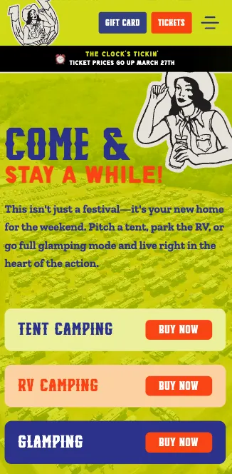
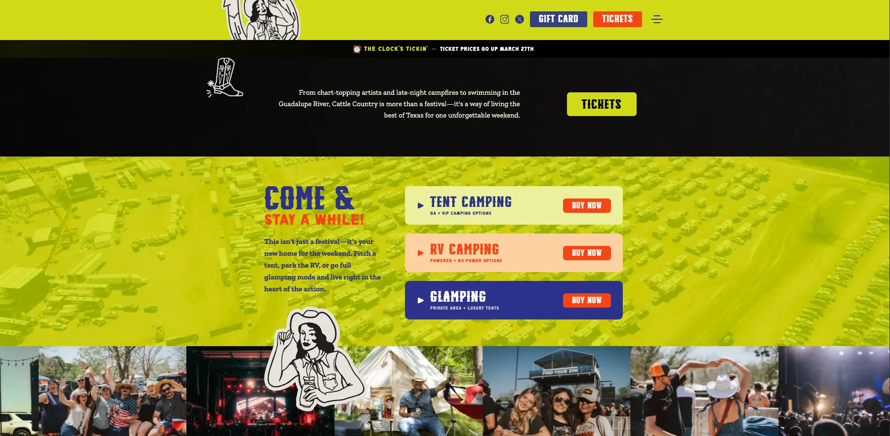
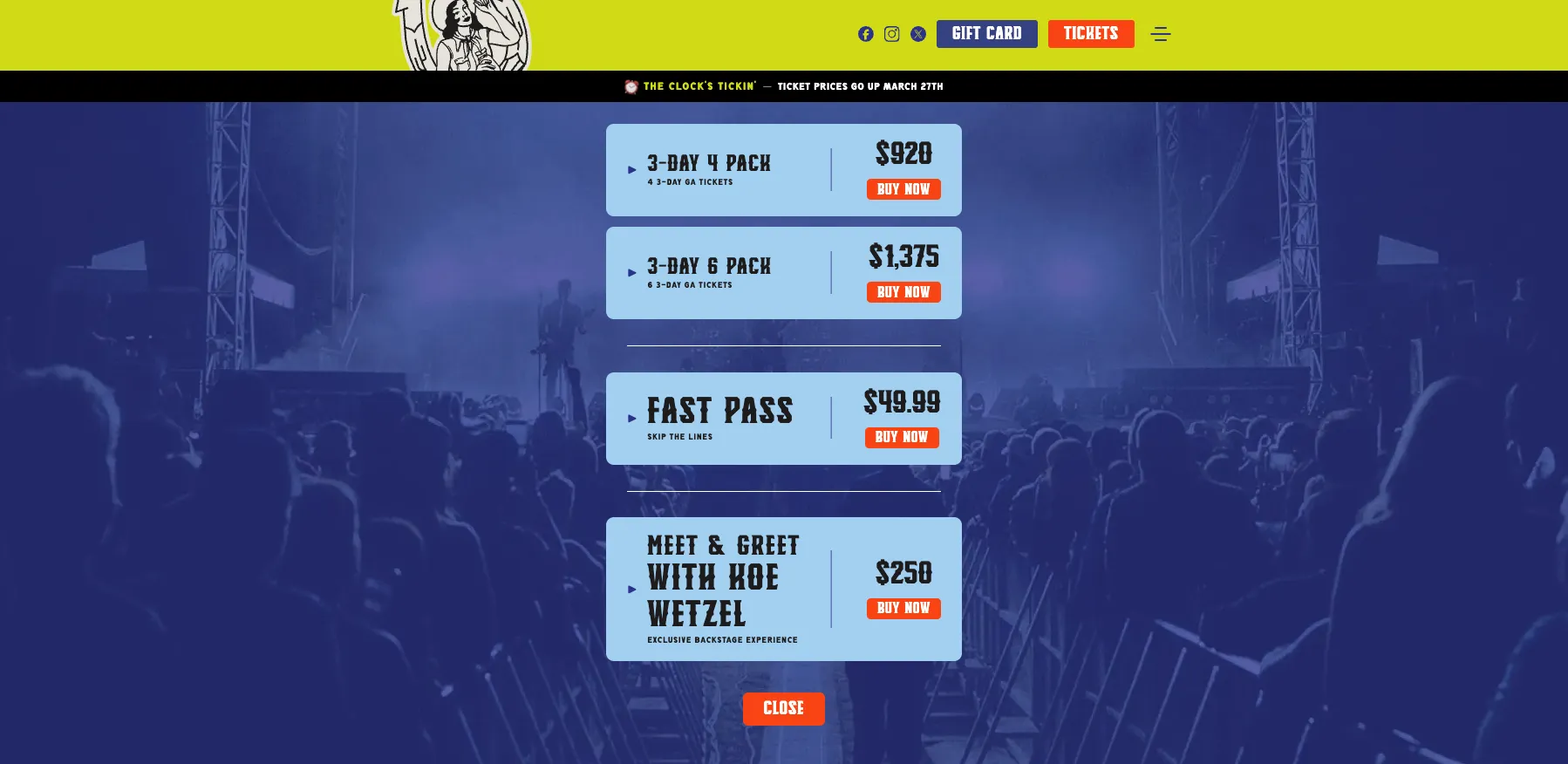
Built the camping + group flow as the core.
Most of the revenue is camping tiers and group packages. We made comparing them brain-dead simple — three columns, the differences, the buttons. Then we wrapped the rest of the site around that decision.
Sponsor wall that scales without our help.
Forty-plus sponsors and counting. We built it as a data-driven carousel that adds a logo anywhere it shows up on the site from a single source. No more 'can you add a sponsor real quick' emails.
Most tickets get bought on a phone in a parking lot.