A family law firm for serious matters needs a site that feels that way.
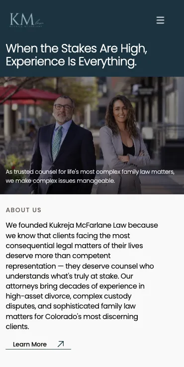
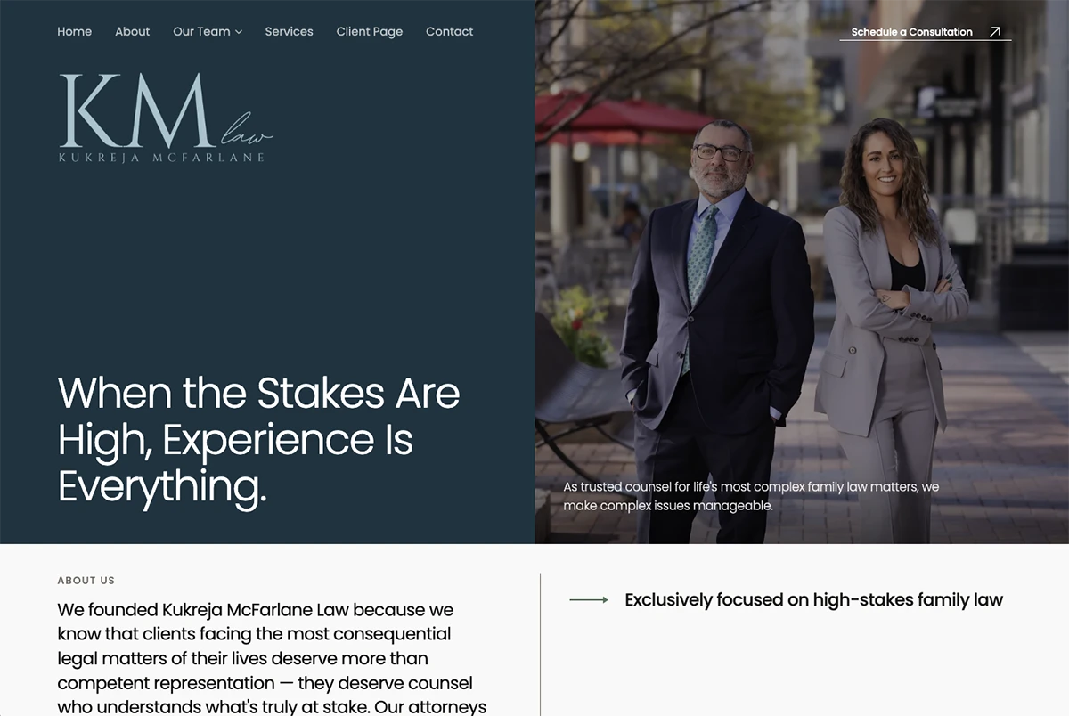
Kukreja McFarlane is a Denver family law firm focused on high-asset divorce and complex custody. Their clients aren't shopping by price; they're choosing counsel for one of the worst moments of their lives. The old site looked like a thousand other family-law sites: stock photos, generic copy, no signal that the work happening here is different.
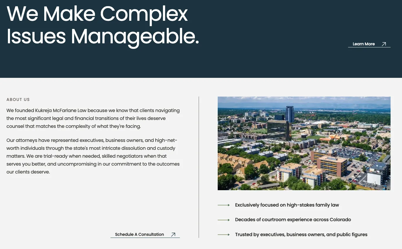
A discreet, high-end marketing site that reads like the firm itself: calm, confident, no flash. Editorial typography, restrained color, partner bios that earn their length. Service pages organized around the kind of matters they actually take, not a generic list of family-law keywords.
A site the partners are comfortable sending to a referring attorney, a CPA, or a prospective client. The kind of restraint that signals expertise without ever shouting.
Quiet, fast, deliberate.
Ten pages. Each one written for one specific reader.
We wanted a site that didn't apologize for being expensive and didn't oversell either. Bullfinch built one that just shows the work and gets out of the way.
Three weeks of restraint.
We pulled references from publishing, not from law-firm sites.
Most legal-services sites look the same because they reference each other. We pulled from editorial design, financial advisor brand systems, and luxury hospitality instead.
Wrote the service pages by sitting with the partners.
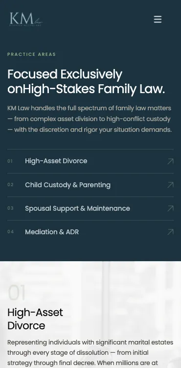
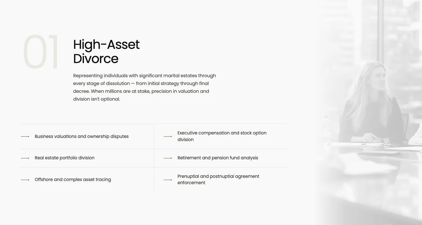
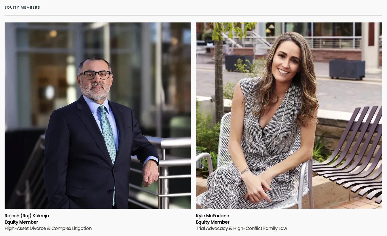
The four service areas — high-asset divorce, complex custody, spousal support, mediation — each got its own voice and structure. We sat with Raj and Kyle until the copy sounded like them, not a content brief.
Built it like a brochure. Loaded it like a static site.
No CMS bloat. No analytics circus. Astro static, edge-cached, fast everywhere. The kind of performance their clients won't notice — which is the point.
Most first contact happens on a phone, late at night.