A new website for Cahoots Tavern.
A bar like this one doesn't deserve a stock restaurant template.
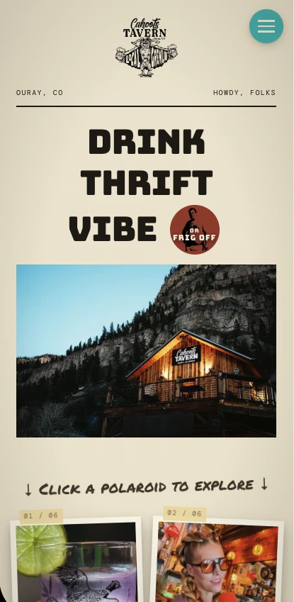
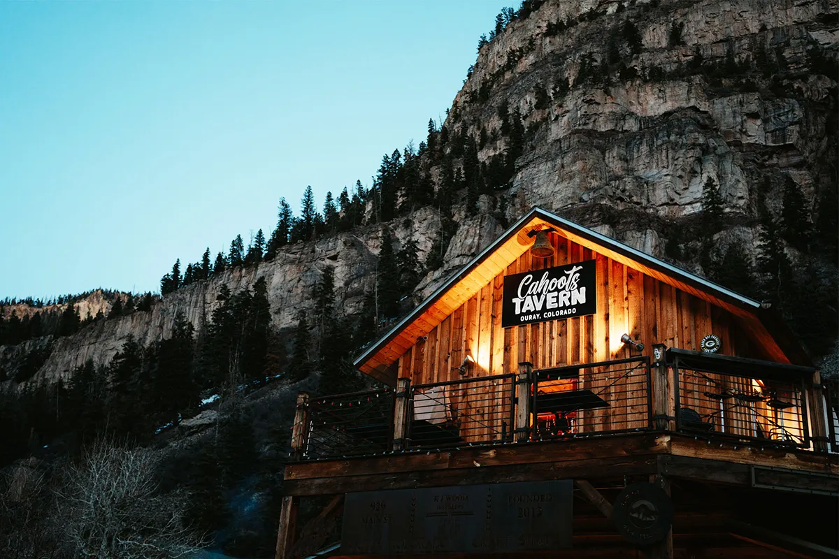
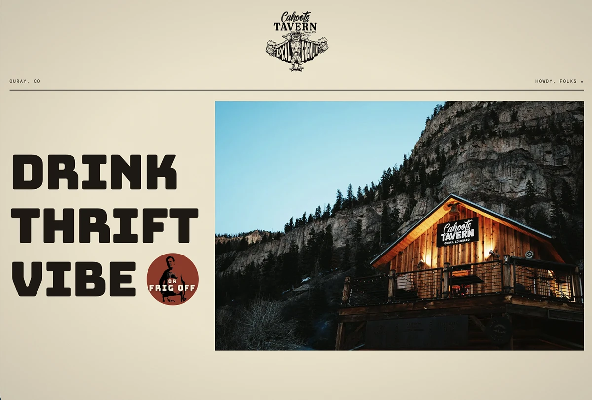
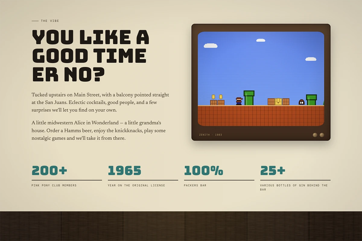
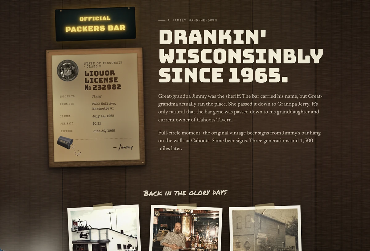
Crystal runs an eclectic tavern in Ouray — taxidermy on the walls, vintage signs, a soundtrack you wouldn't expect. The Squarespace site she'd been carrying along didn't carry any of it through. Tourists looking up Ouray bars bounced. Locals showed up by word of mouth.
We talked, we listened, we studied the place. Pulled inspiration from her socials, her menu, the stories she told us. Then we built a small, custom site shaped around what's actually on the walls. Menu, hours, events, directions — nothing more, nothing less.
A site that feels like walking into Cahoots — eclectic, weird in the good way, useful for the things people actually came looking for. The kind of page you bookmark for the next time you're driving through Ouray.
Specific, fast, hers.
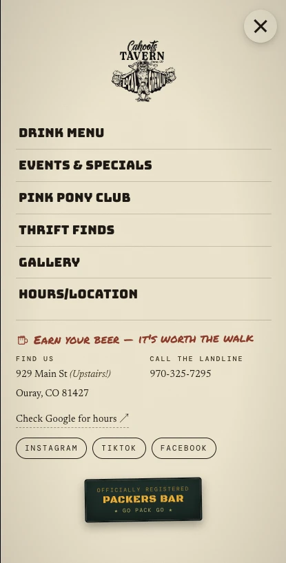
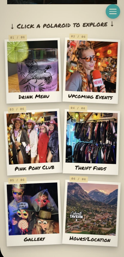
Four pages. The ones Crystal actually wanted.
I'm a little weird about Cahoots. Very specific about how it should feel. Katie and Kyle got it on the first try, which never happens. Best money I've spent on the place since the new sound system.
A few weeks. A lot of fun. One Cahoots.
We started by listening.
Long-form calls with Crystal, deep dives into her photos and socials, and a lot of attention to the way she actually talks about Cahoots. By the end of discovery, we had a brand brief shaped around the room itself — nostalgia, vintage signs, weird in the good way.
Custom from the ground up.
No template, no theme — we built the site to match the bar's specific eclectic energy. Typography, layouts, photo treatments, all shaped around how Cahoots actually feels.
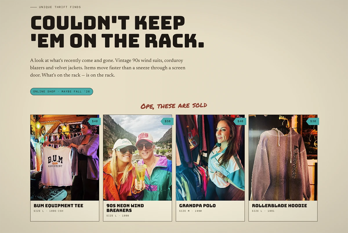
The info people actually want.
Menu, hours, location, events — and a small "about" section in Crystal's voice. No bloat, no carousel hero, no "want to rent the space?" pop-up. The site does what a tavern site should do.
Most of her traffic is road-trippers checking their phone.