A new website for Analog Jiu Jitsu.
A gym with a culture. A site that actually shows it.
Analog is a new no-gi jiu jitsu and Muay Thai gym in North Austin built on a philosophy; a constraints-led approach to training, a deep connection between martial arts and music, and two friends with 30 years of history between them. The old GymDesk site they inherited couldn't communicate any of that. It looked like every other gym on the internet.
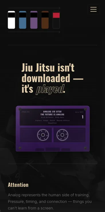
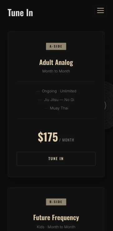
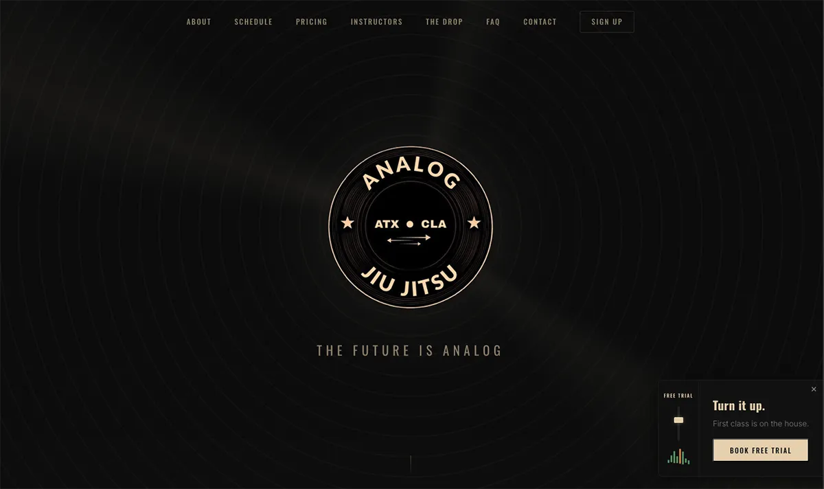
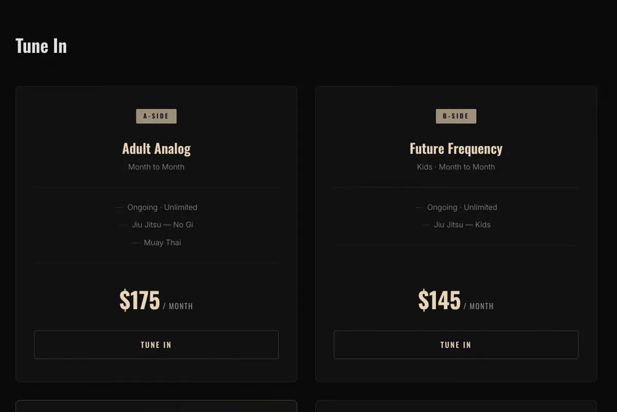
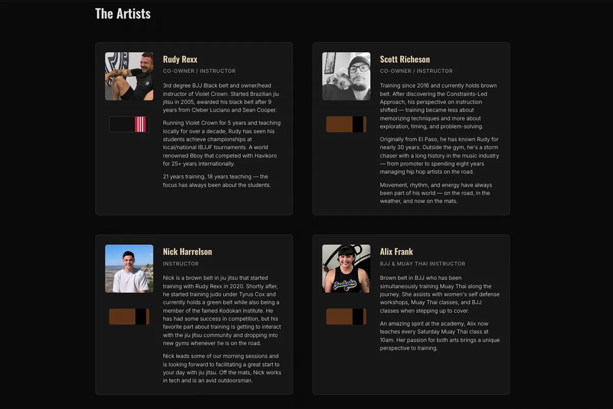
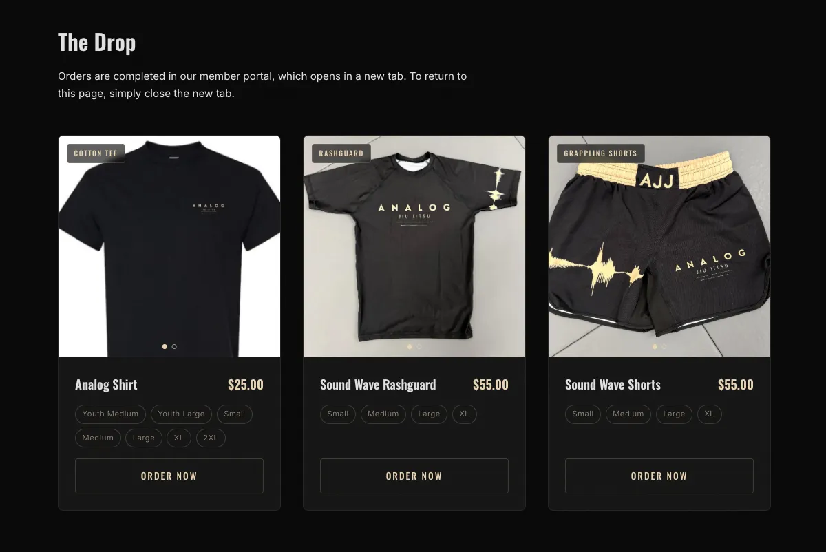
A custom Astro.js site built from scratch to reflect the Analog identity. Music industry language woven throughout the copy ("The Tracklist," "Tune In," "The Artists," "The Drop"), a free trial conversion flow, an instructor section, a full pricing breakdown, and a merch section that surfaces all three products with sizing and pricing upfront so users never have to navigate blind into the member portal.
A site that feels like the gym. Visitors understand the culture before they ever walk through the door. The free trial CTA is prominent and frictionless. And when someone wants to buy a shirt, they know exactly what they're getting before they click.
Built for a culture, not a category.
One page. The whole record.

Literally the best team in the business. They went above and beyond to get our website working in a week. We are extremely happy with the results. Thank you Bullfinch team.
Culture first. Then the code.
We wrote the site before we designed it.
Analog's identity is rooted in music, martial arts, and a specific training methodology most people have never heard of. Before touching a component, we defined the language system (section names, CTA copy, instructor bios, and the philosophy framing) so the design had something real to build around.
GymDesk is functional. We made it invisible.
Analog uses GymDesk for signups, scheduling, and their store. The problem is once a visitor enters GymDesk, there's no way back to the main site. We solved this by surfacing everything a user needs (pricing, schedules, merch with sizes and prices) directly on the Analog site, so GymDesk only gets touched at the moment of purchase or signup, never for browsing.
The merch section was a UX decision, not a design one.
Rather than linking to the GymDesk store overview, each product card links directly to its individual checkout page and opens in a new tab so the main site stays live underneath. Sizes and pricing are listed upfront so nobody clicks through only to find out something doesn't fit or is out of budget.
Austin is the BJJ capital of the US. Standing out starts on a phone screen.